Why we killed the Features page at Neeto

2026-10-04 08:17:54 UTC
Every SaaS product seems to need two pages: Features and Pricing. At Neeto, we had both. Nothing was particularly wrong with either of them.
But there was one problem.
I almost never visited our Features page.
Whenever I wanted to check whether NeetoCal supported something, or show a particular feature to a potential customer, I went straight to the Pricing page.
The reason was simple: the Pricing page was much more useful.
Our Features page looked like most SaaS feature pages. Each feature had its own section with a heading, some text, maybe an image, and plenty of whitespace. It looked nice, but finding a particular feature meant scrolling and scrolling.
The Pricing page was different.
It had to show people exactly what they were getting, so it contained a dense list of features. I could scan it quickly, find what I was looking for, and move on.
Months would go by without me visiting the Features page.
Eventually, that started bothering me.
If I work on the product every day and I instinctively avoid the Features page when I need information about our features, why are we maintaining that page?
So we killed it.
Neeto products now have a single Features & Pricing page.
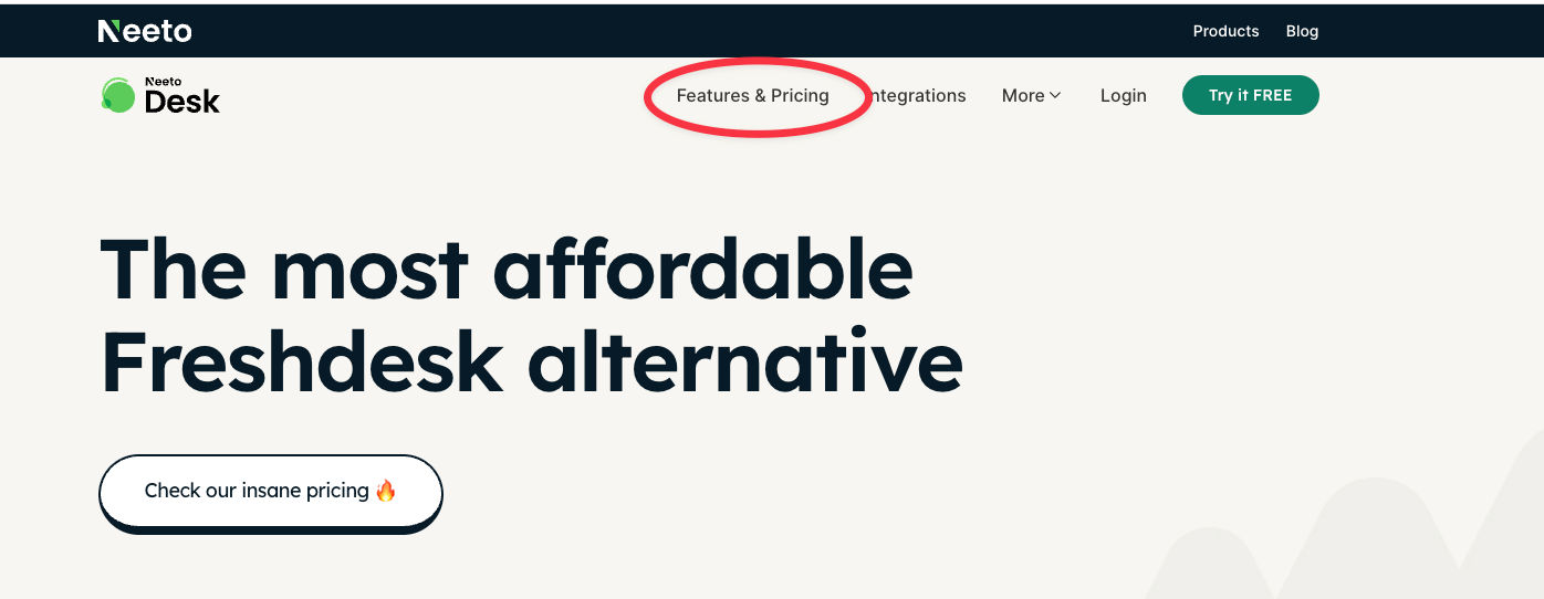
Instead of maintaining one page to explain what the product does and another page to explain what it costs, we put everything in one place.
The page starts with pricing, followed by a dense list of everything included in the product.
But we didn’t want to lose the additional information that used to live on the Features page.
So each feature can be expanded.
If you just want to know whether NeetoCal supports round-robin scheduling, you can scan the list and find it quickly.
If you want to learn more about round-robin scheduling, click on it and you’ll get the details right there.
No jumping between Features and Pricing. No giant blocks of whitespace. No hunting through a long marketing page.
When someone looks at pricing, they’re rarely interested only in the price.
They’re asking: What do I get for this price?
Answering that question requires talking about features.
And when someone is looking at features, sooner or later they’re going to ask: How much does this cost?
Features and pricing aren’t really two separate conversations.
So why did we have two separate pages?
Mostly because that’s how SaaS websites are built. We had simply followed the convention.
Previously, feature details could live in multiple places. We might describe it one way on the Features page and another way on the Pricing page.
Now there is one place.
One feature name. One description. One URL. One place for us to keep updated.
It also gives search engines a single, information-dense page containing the product’s features, pricing, and detailed explanations instead of spreading that information across multiple overlapping pages.
Most SaaS products will probably continue to have separate Features and Pricing pages.
That’s perfectly fine.
We had them too.
But when we looked at how we actually used our own website, the Features page had become largely redundant.
So we stopped maintaining a page simply because SaaS companies are supposed to have one.
Now we have Features & Pricing.
And I haven’t missed the old Features page once.